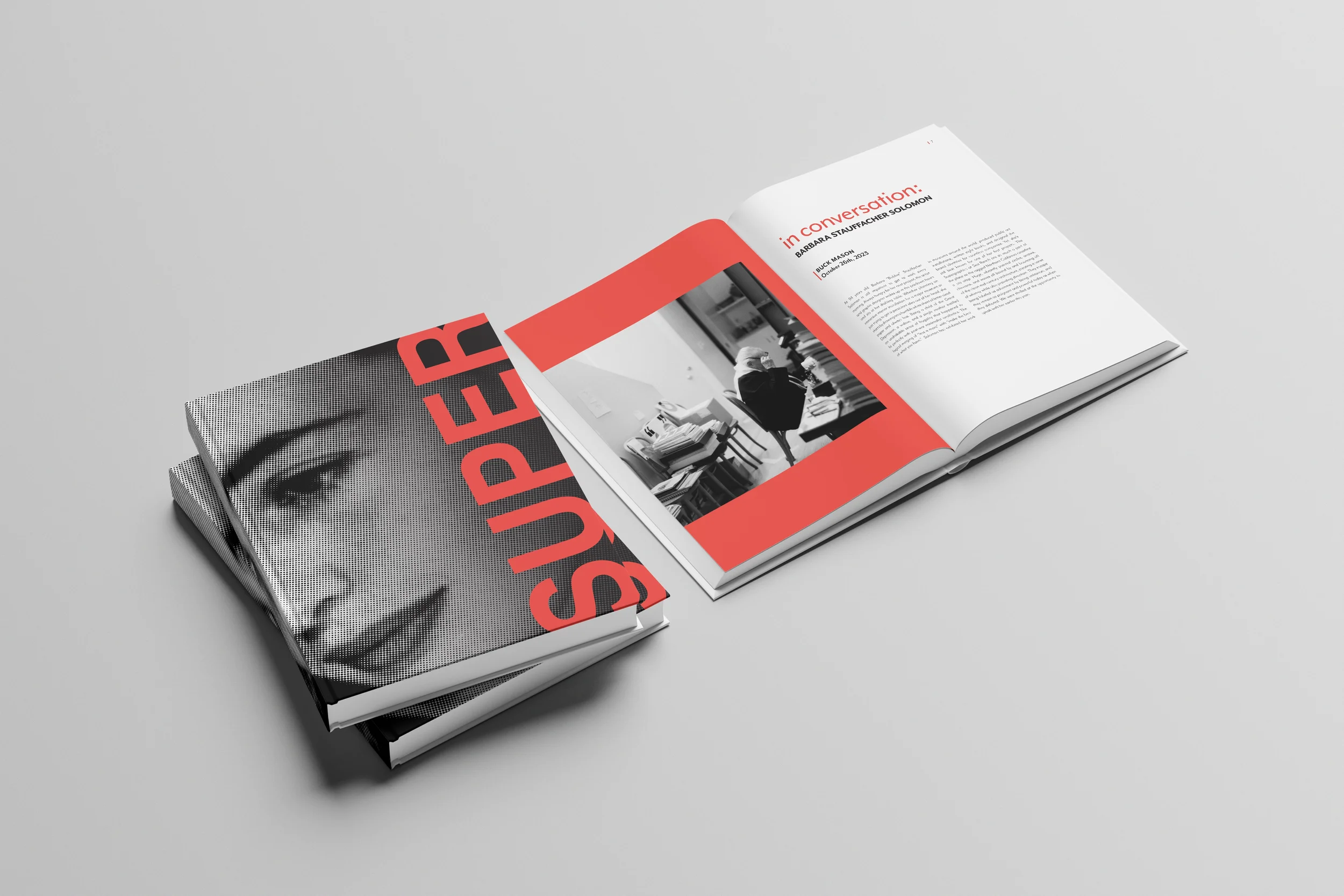
SUPER Book
Editorial Layout + Branding + Typography
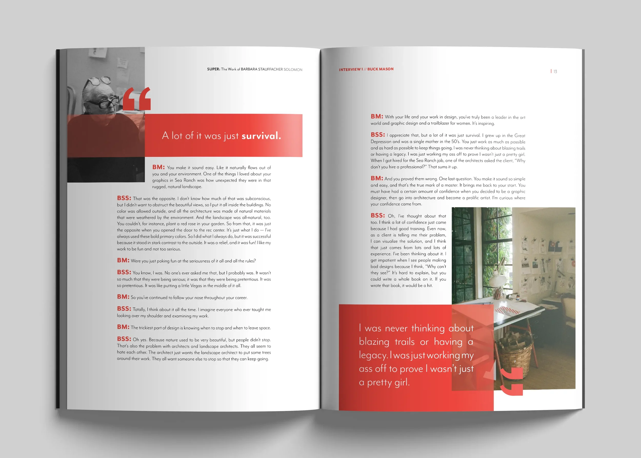
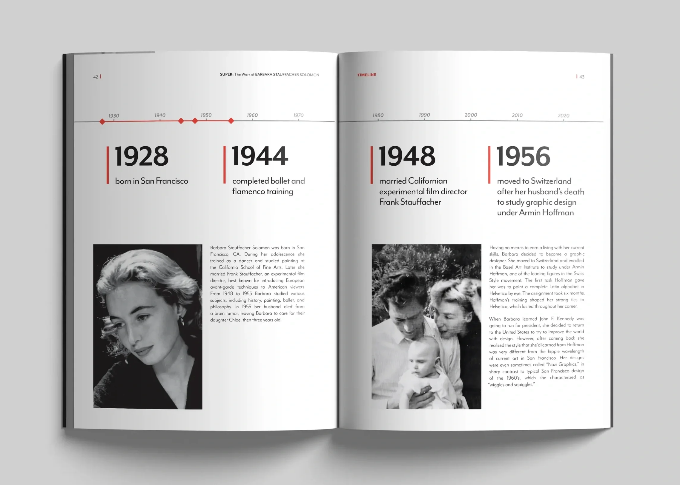
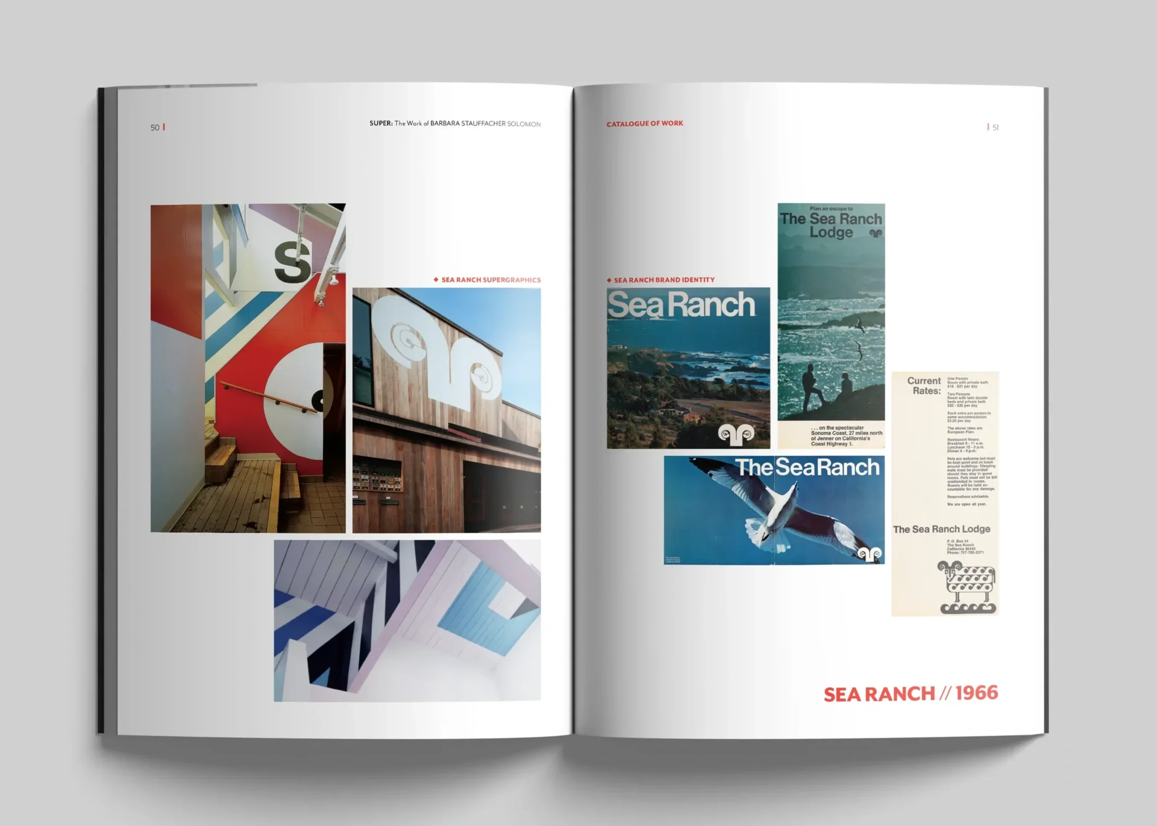
For this project I was tasked with creating a roughly 60 page book covering the life and work of 20th century graphic design legend Barbara Stauffacher Solomon. I had to design various spreads including interviews, timelines, work catalogues, section openers, and so on while reflecting Barbara’s personality and style.
Process P1
I started by designing a grid and system for my various kinds of spreads while keeping in mind the following questions.
How do you evoke the feeling of an artist without mimicking their style?
How do you create a style that is subtle enough to let image heavy spreads speak for themselves, while providing enough visual interest in text dominant contexts?
How do you achieve visual cohesion with photos spanning 70 years and utilize low quality web images in a high quality print context?
How can you achieve the illusion of consistency with dramatic variance in source materials?
Here I have included rough drafts of spread styles for section opener, timeline, and information spreads.
Process P2
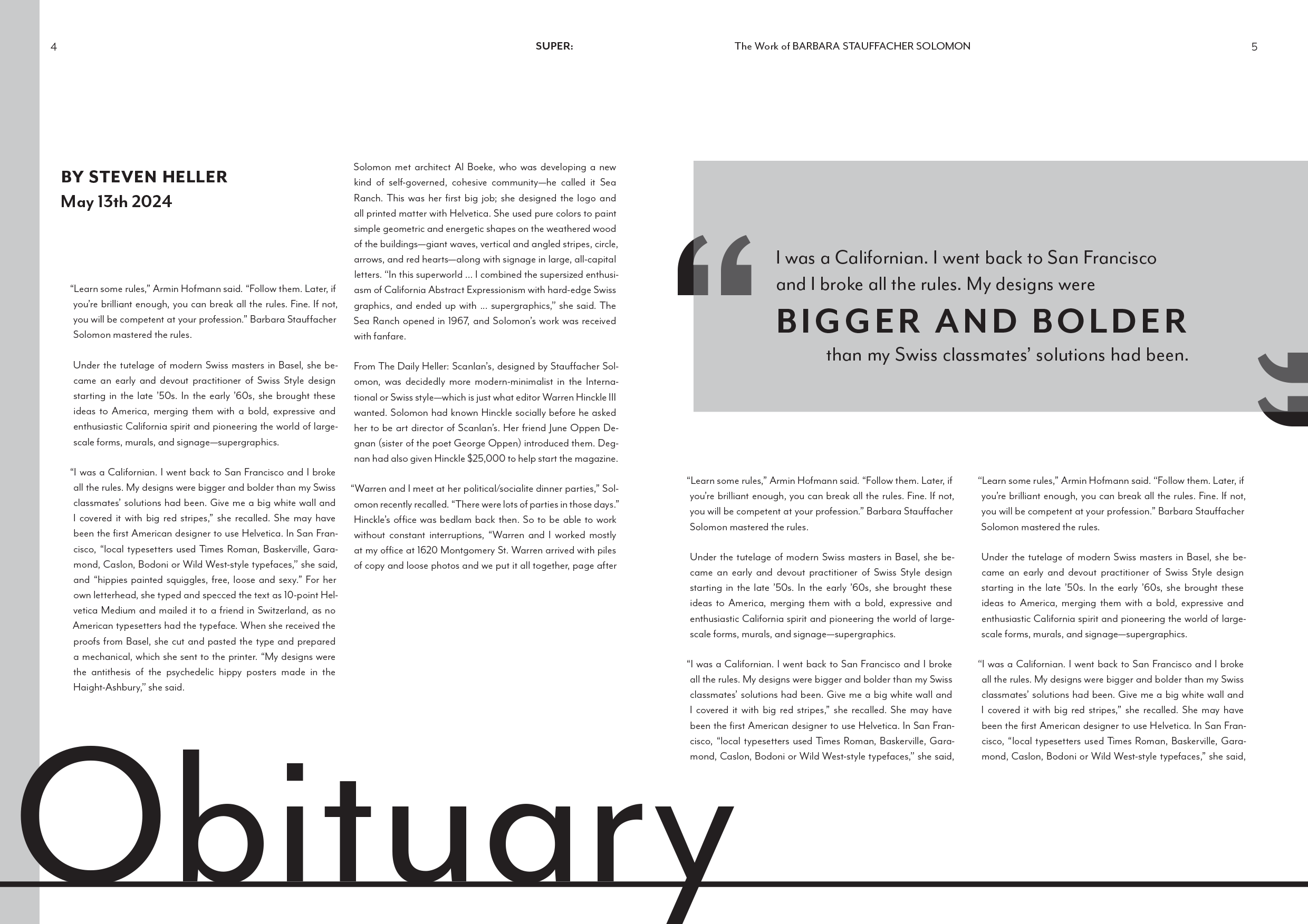
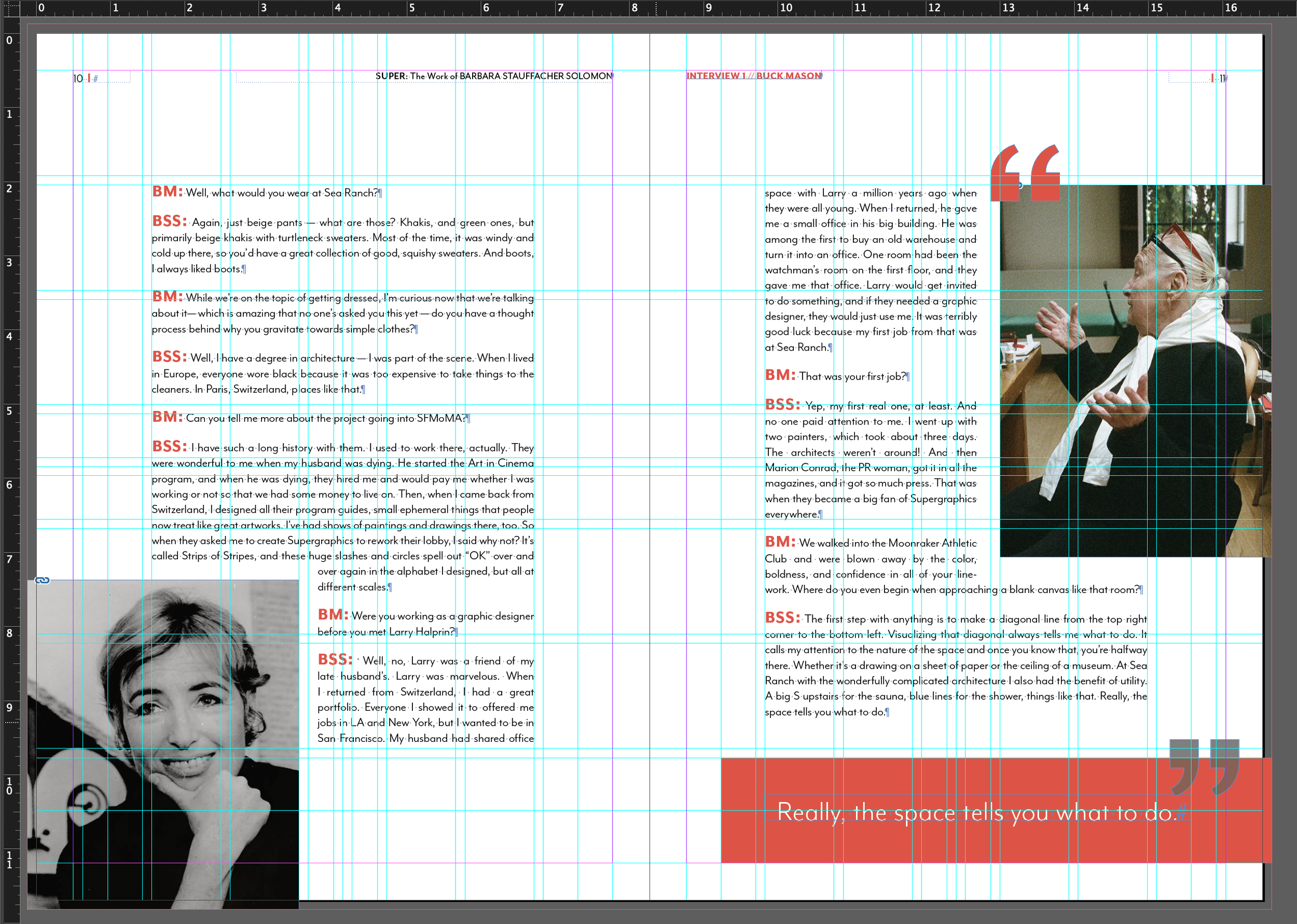
Through rounds of feedback and experimentation I ended up with a complex but dynamic grid that was able to provide the necessary flexibility for my various spread types while maintaining a cohesive feel. I developed a color scheme, type system, and styles for repeated elements like pull quotes.
Final Spreads